The objective of this project was to create a magazine ad for a fictional brand of craft beer (which was of my own design). This was accomplished in collaboration with a class of photography students, however; all photography in the final product is my own.
With my fictional brewery already designed in a previous project, my first task was to determine the target audience for my beer. My brewery, called "The Chosen Ones", is very fantastical in its theme and caters to people of all demographics who love adventure and whimsy. The specific line of beer I created are nautical themed, so I took a lot of inspiration from swashbuckling tropes and visuals.
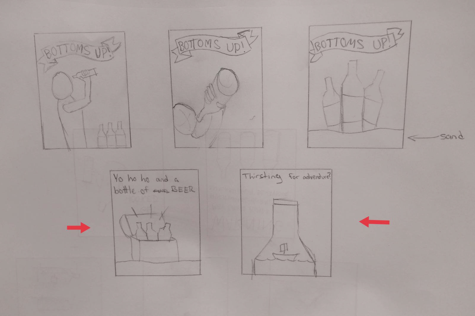
Five of my initial concept sketches. Two of the sketches I considered developing further are indicated with red arrows.
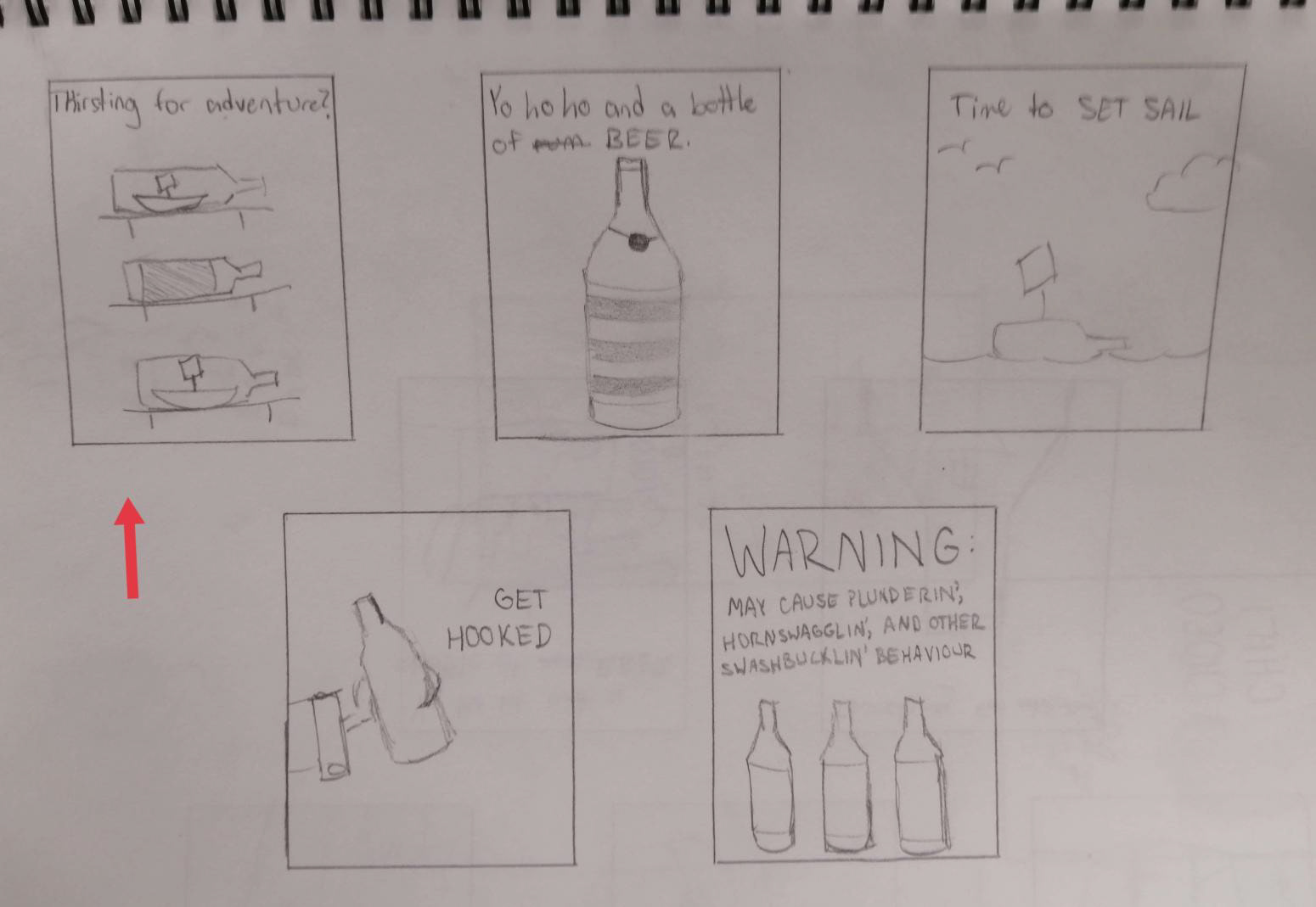
Five more of my initial concept sketches. One of the sketches I considered developing further is indicated with a red arrow.
After sketching out some ideas, I chose two of my three favourites and fleshed them out a little more. At this point I was collaborating with a photography student from a different class, whose job was to take photos of my beer according to instructions I sent them. Unfortunately, the composition of the photo I requested from them ended up being different from the concept I decided to move forward with, meaning I needed to do my own photography. This proved to be an interesting challenge, because I had to capture the reflective surface of the bottles while ensuring that I wouldn't be visible in the reflection.
I used a dark colour scheme to draw attention to the beer bottle. I wanted to make the beer look appealing yet slightly mysterious, almost like hidden treasure. I used the same tagline for both concepts because I thought it made for fun wordplay.
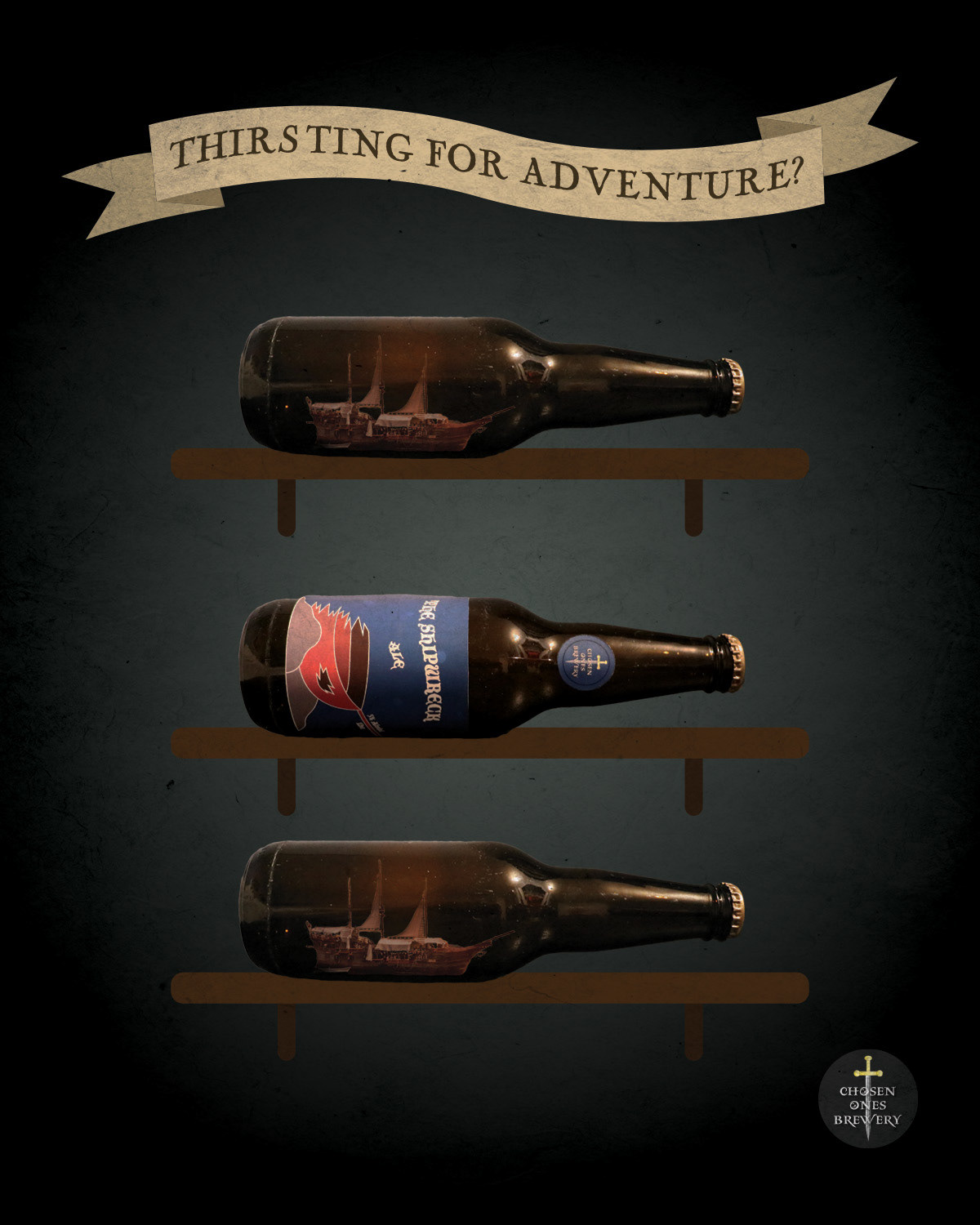
One of my rough concepts, depicting the beer bottle in between two ships in bottles.
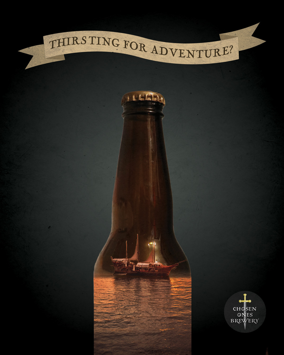
One of my rough concepts, depicting a ship sailing on an ocean within the bottle.
After this stage, I continued to refine my designs based on the feedback of my classmates and professor. I removed the paper graphic the tagline was written on so that it could be larger and have more emphasis. At first, I was hesitant to remove an element I had put a fair amount of effort into, but it was definitely the right decision for the design. I also created some more realistic looking shelves for the concept on the left. Turns out it's hard to find a royalty-free photo of a plain wooden shelf, so I found a photo of a colourful shelf and digitally painted it to match.
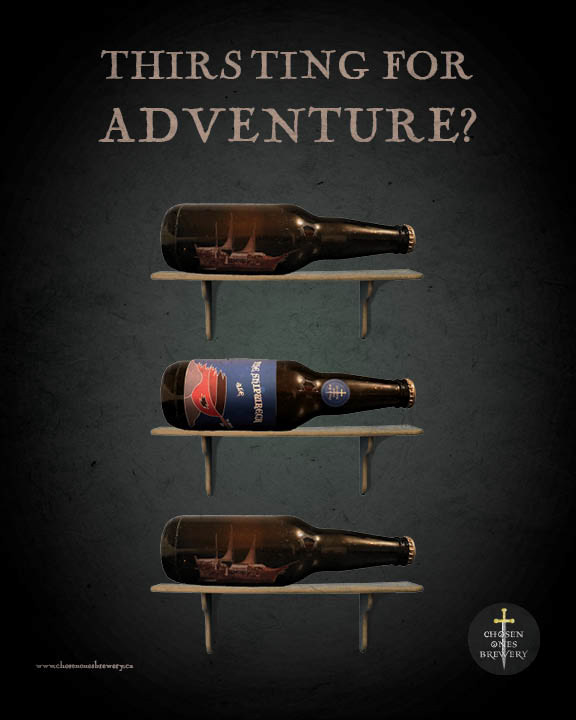
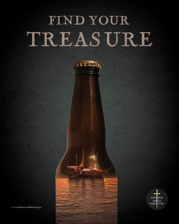
At last, for the final product, all that was left to do was to choose my favourite design and improve the readability of the brewery's website.
I genuinely had a lot of fun with this project. I learned how to do product photography without a studio, had to improvise solutions when things didn't go according to plan, and as a bonus, I came out with a design I'm quite proud of.
